Design & Art Direction
Thumbtack_title_yoga_v2.jpg

Thumbtack Rebrand

tt_homepage_mock_crop.jpg
 

Branding, Product Design, Motion

Thumbtack spent 9 years not thinking about brand. They thought about growth, and scrappiness and hiring a piano teacher for your kid, but brand took a backseat. For many many years the Thumbtack brand was little more than a typeface, a logo and orange. So much orange.

In 2018, it was finally time for Thumbtack to embark on it’s first comprehensive rebrand, and I was fortunate enough to be dedicated to the project with a small team to help lead design on the process from the ground floor. The process was a company wide effort, bringing together teams across product, engineering, marketing and design.

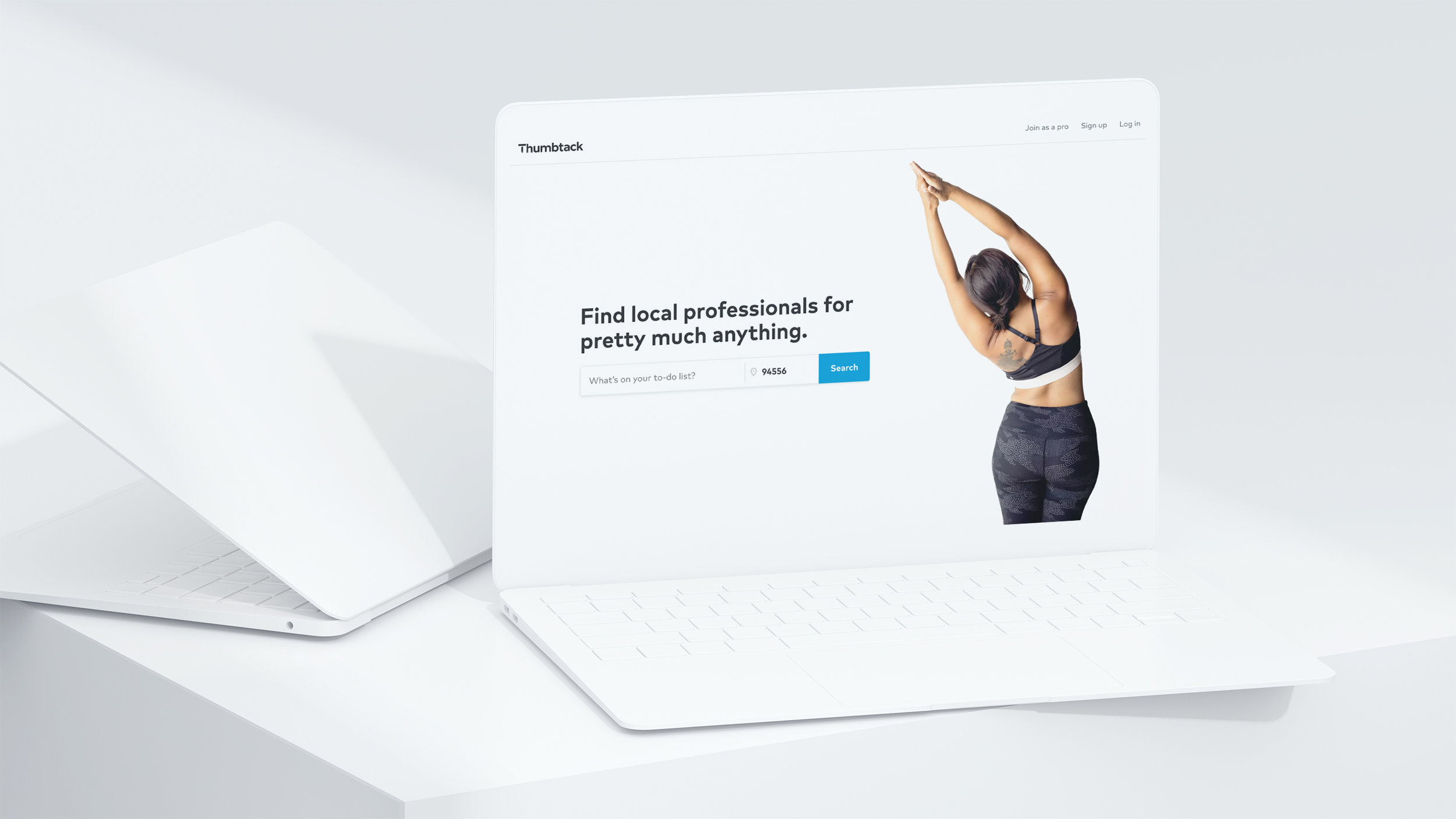
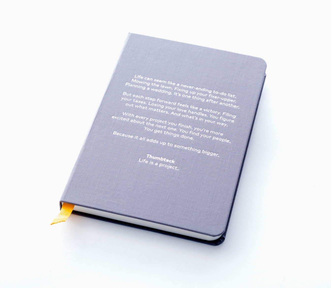
The positioning started with a single ideal. We make it easier to get more done. That’s our brand promise to customers and pros — a promise grounded in ease, possibility and accomplishment. These principles guide our words, our illustrations, our videos, everything.

 
Thumbtack-Logo-v03(A)_large.gif
The Thumbtack logo is finally an actual tack, not a pushpin. Iconic brands like Apple, Shell or Target all utilize a natural shape that is a substitute for the word. We moved forward with this direction because it accomplishes this but also seamlessly integrates between word mark and icon. The color is accessible and ownable in the local services space, with competitors using oranges and greens primarily. Additionally, the Thumbtack Blue was designed to have a calming effect on viewers as they embark on projects to improve their lives.
 
Companies tend to create different branding for different sides of the marketplace. One for pros, one for customers. But everyone on Thumbtack is looking for the same thing - a job well done. So we built a single brand that works for both.
 
The new logo is one of my favorite of the year so far with the best possible thumbtack depiction that doubles as a “T.” It may seem like an obvious solution but it’s done perfectly right, with a deep, hard shadow that makes the tiny thumbtack look more monumental and bigger than life.”

Armin Vit, Under Consideration

 
Life is a Project - Notebook.jpg
We chose a clean, modern geometric and hard working typeface that could stand alone on a poster or work hard as a paragraph of body copy.
 
A typographic manifesto film was designed to bring the new radically honest writing style to life in a playful way. Additionally, the film showed off the new brand typeface in unexpected and playful ways, making the writing accessible and approachable to anyone.
 
We built custom iconography for our metas, and created a secondary palette of accessible colors that bring vibrancy to the brand and speak to possibility. A playful illustration style was developed to play a secondary role to more prominent photography.
 
Photography - Pros - Gardener.jpg
Our pros do literally everything you can think of, and they do it on their own, forging small businesses all across the country. When we show pros, we photograph real Thumbtack pros in their best light as larger than life heroes. Shot in the studio by Will Miller and Jenavieve Belair, this imagery is arguably the most compelling product photography used across the brand.
 

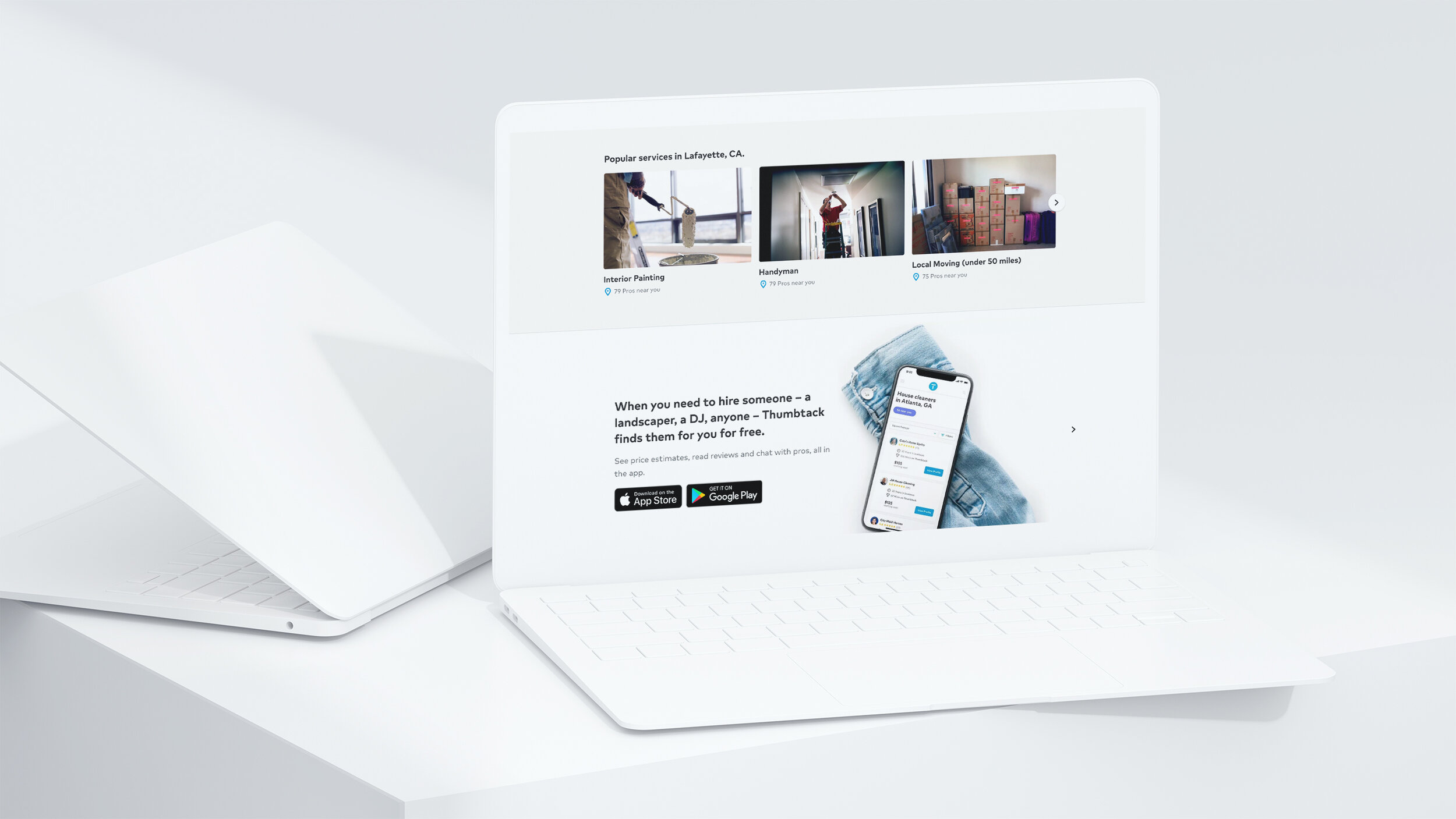
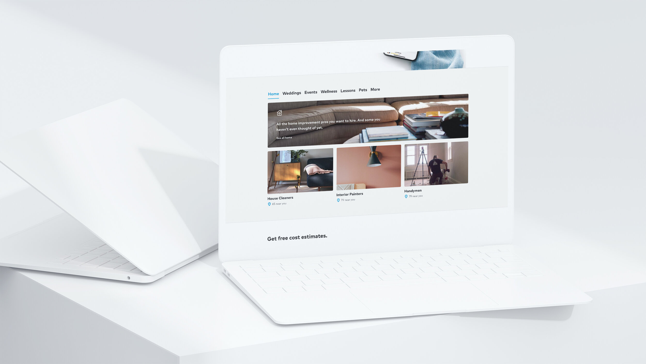
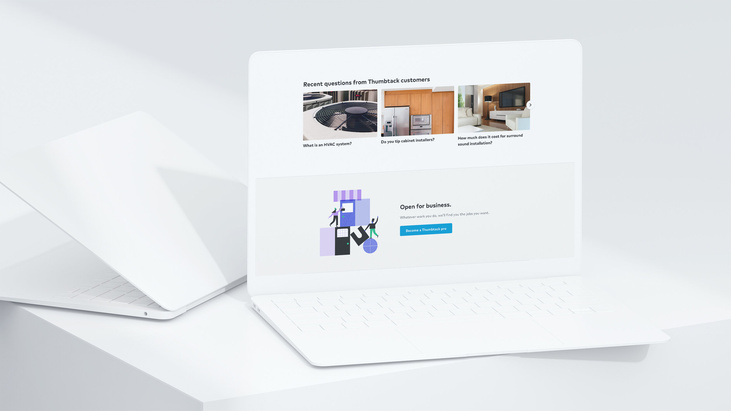
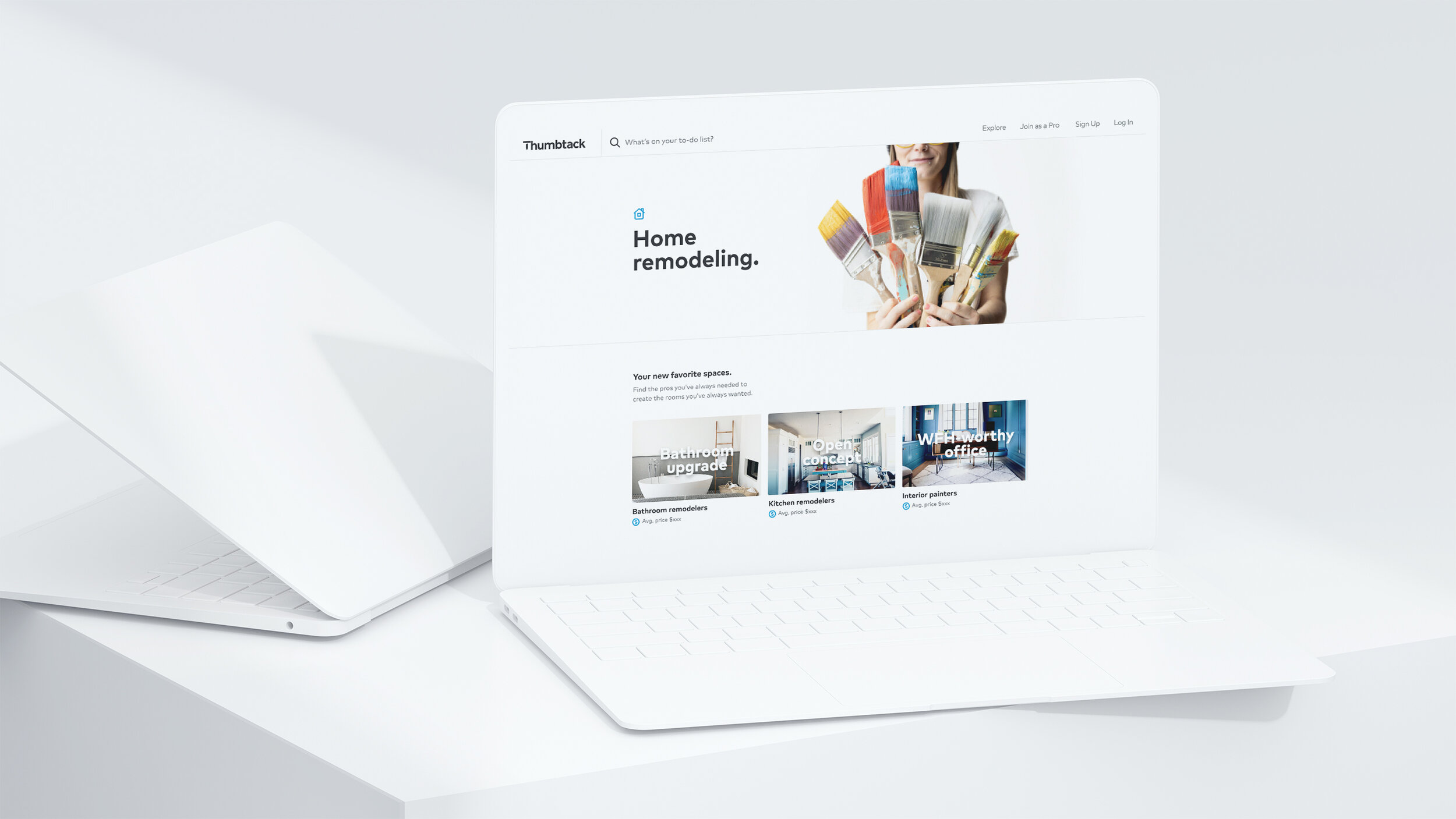
After all the rebrand building blocks were in place, it was time to overhaul thumbtack.com. Given it’s the first impression for many people checking out Thumbtack, it needed to be simple, beautiful and concise. When people embark on any new project, it’s a blank canvas. This became a grounding principle for Thumbtack’s new homepage.

 
MacBook-003_half.jpg
The page is designed to showcase breadth and possibility. This is achieved through a prominent and minimal search. Additionally, Thumbtack’s meta categories are a huge differentiator for our brand so they are featured prominently.
 
We are constantly iterating and testing various ideas on the homepage to maximize its performance and brand impact. This includes varying imagery, and also testing different placements / heirarchy of modules.
 
In support of the homepage, meta pages create an opportunity to bundle offerings within a vertical. These pages provided the perfect canvas for additional portraiture and supporting imagery beyond the homepage.